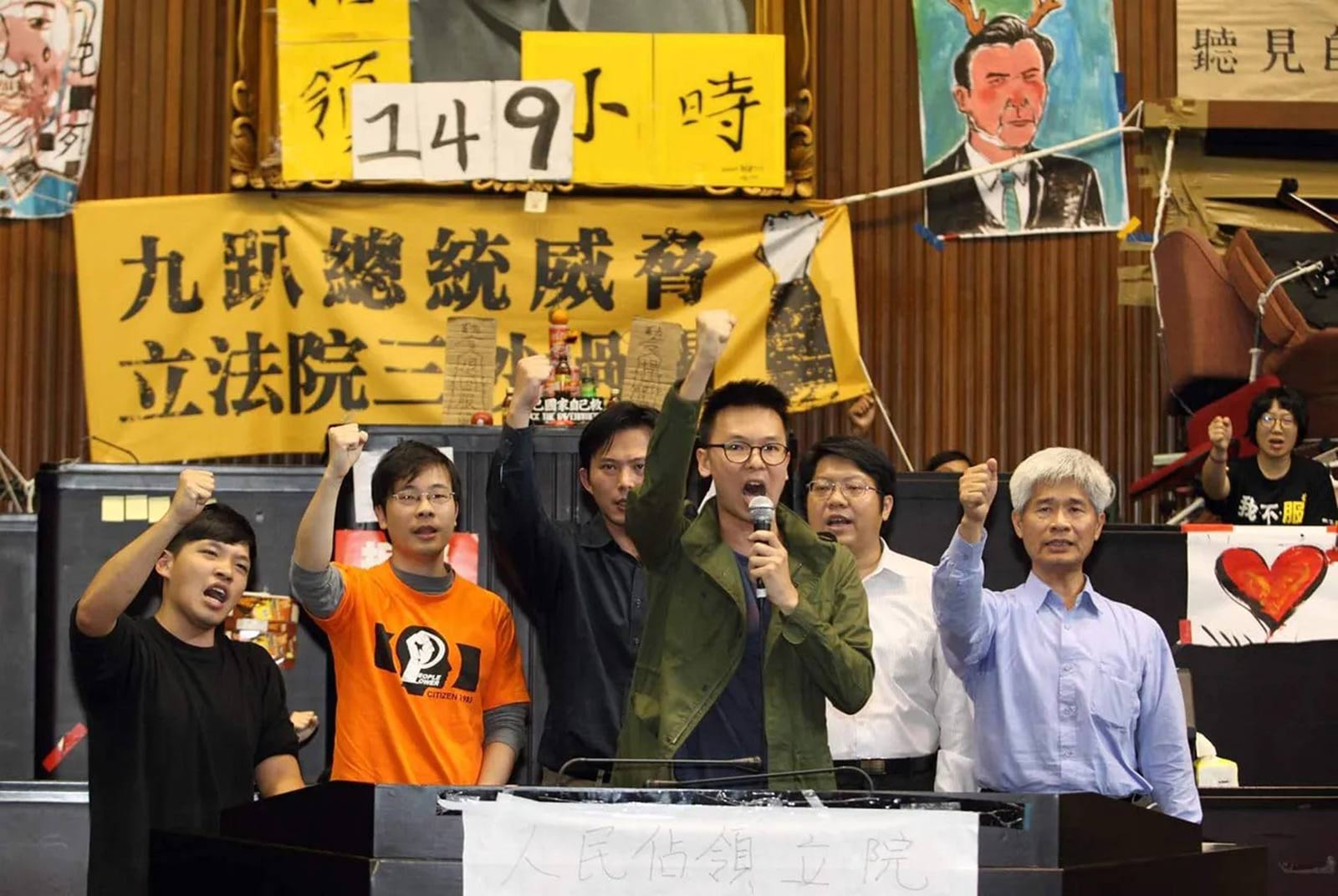
Behind the Digital Newsroom
‘Taiwan: The Water-Starved Island’ Interactive Maps
Source:Jessica Liu
When CommonWealth Magazine ran a series earlier this year on “Taiwan: The Water-starved Island,” then digital editor Jessica Liu had barely a month to put together a digital package for the project. Here’s the back story on how the maps were done.
Views
‘Taiwan: The Water-Starved Island’ Interactive Maps
By Jessica Liuweb only
When CommonWealth Magazine ran a series on why Taiwan can be short of water even when it get plenty of precipitation, it focused on Shihmen Reservoir to tell the story. (Read: Taiwan: The Water-starved Island)
After a four-month investigation, a CommonWealth team found that illegal land use in the reservoir’s catchment area and other manmade incursions were triggering a huge silt buildup in the reservoir, eroding its storage capacity.
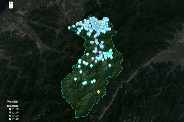
To drive the point home of how rampant the abuse was, we wanted to display the locations of illegally developed sites using graphics and maps, and we ended up with two main components in preparing the digital package: a map showing reported land-use violations that caused some of the water problems and a “map story.”
I. Map of Reported Land-use Violations
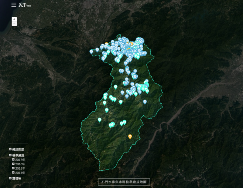
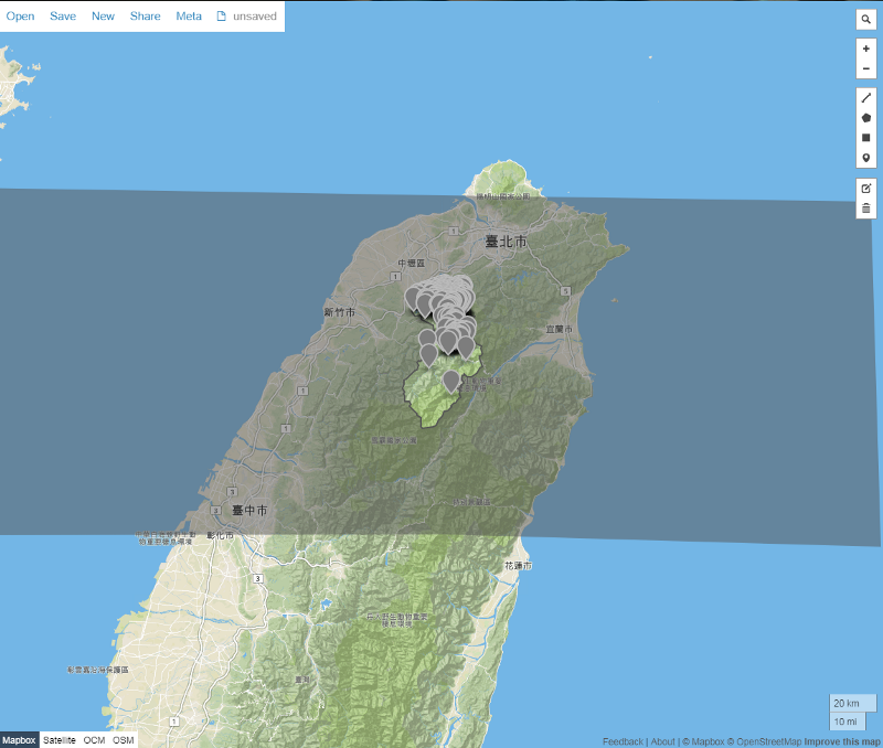
Based on our previous experience in editing maps for a series on Taiwan’s agricultural land, we decided to use leaflet.js to insert information on reported land-use violations. The main visuals for this package were added to a map of Taiwan from Google Earth.

The digital design started with a template as per the image above. The goal was to highlight the Shihmen Reservoir catchment area, resulting in a bright area in the middle of the map framed by a solid green border and darkened surrounding landscape.
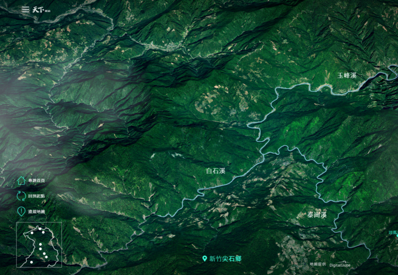
Having never used this type of graphic layer, we first thought about drawing a big frame and either creating a “hole” or adding a layer inside it, but that ended up not working out. We then thought about dividing the image into three photos and then combining them (as in the image below).
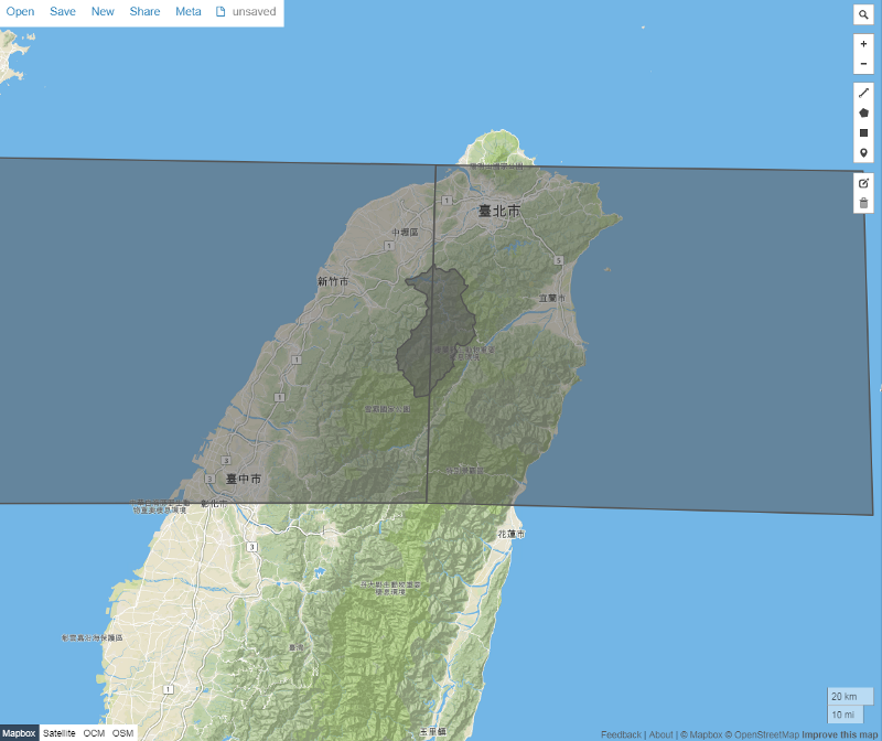
Before the graphic was produced, the story’s researcher used GIS (geographic information systems) to get the coordinates of the Shihmen Reservoir catchment area. They were then entered on the geojson.io website (a data format for encoding geographical data structures), and efforts to manually match the Shihmen Reservoir catchment area coordinates with positions in the rectangular image began.
Finally, we created the mask that we were looking for and exported it into a geojson file. Using methods of leaflect.js — getBounds () to limit the extent of how much users could scroll on the map.
II. Map Story
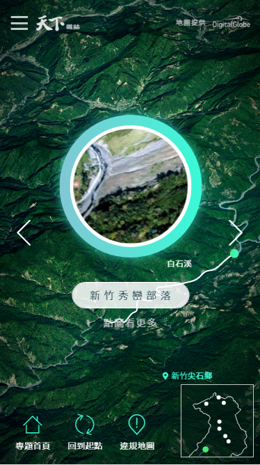
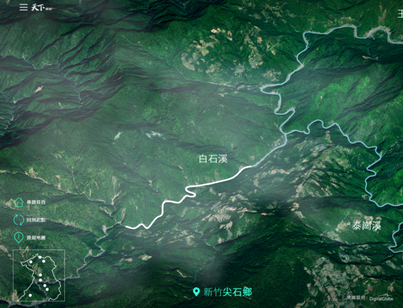
Satellite Map
It became apparent that the star of this digital feature was the satellite map. When the team decided to use a satellite map, it faced a challenge – based on past experience producing interactive maps, we knew Taiwan does not make public high-resolution map APIs (application programming interfaces), and the same is true overseas.
The effect we were going for was the clear, high-definition look in the two features below –As Greenland Melts, Where’s the Water Going? in the New York Times and Killing the Colorado: Explore the River in investigative journalism newsroom ProPublica.
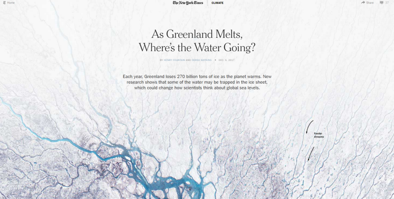 As Greenland Melts, Where’s the Water Going?
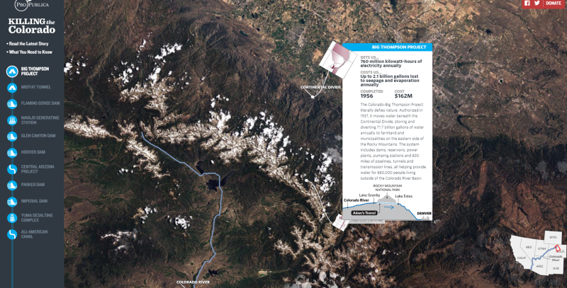 Killing the Colorado: Explore the River
Using such a high-definition, customized graphic layer involves either an outside source or producing one’s own satellite shot in house, but the latter was not an option because of uncertainty over how long it would take. So we began searching for overseas companies producing satellite photos, eventually settling on U.S.-based DigitalGlobe and France-based PlanetObserver.
We later learned DigitalGlobe had an agent in Taiwan so we made contact with the company that way.
Scrollable Maps

Aside from satellite maps, the design of the visual effects also drew on the scrollable map screen used in Mitsubishi’s Outlander PHEV. The description of that campaign can be seen here.
This is not the first time I relied on this technology, but the visual effects for this project were incredible. The scrolling experience navigating to map locations that pop up or reveal a Lightbox button image is extremely smooth.
There were two main reasons to use these effects as a reference. One is because they reflected the concept of the feature’s map story, the desire to focus attention on points of interest near the Shihmen Reservoir catchment area that were being ravaged by development. The other was that the visual effects were excellent, including subtle 3D effects when going from one point of interest to another.
Collecting Data and the Research Process
After carefully researching the visuals, the project used several .js packages, the most important of which were three.js, mousewhell.js, and GSAP.
Because I had never used three.js to write programs, I spent a week studying it. I pretty quickly decided to abandon XD, and that combined with the need to spend an afternoon for each function that had to be changed meant that I wouldn’t be able to complete the project within two weeks if I got data at the beginning of February.
What to do?
The best way was to return to the original concept and figure out what was essential. The main element that had to stay was the interactive mouse scroll function and the path scroll that could help users understand locations and the state of the area surrounding the Shihmen Reservoir.
I then remembered an article that could help with that.
 Animated Map Path for Interactive Storytelling | Codrops
This article had been around for a while, but the concepts it conveyed were similar to the concept behind this project.
Drawing on the special characteristics of SVG (scalable vector graphics) and then finding examples of GSAP’s CSS transform to manipulate images, we decided to use mousewheel.js and GSAP.
A week before receiving the final data, we set up a test image and fed in information to ensure that the packages could achieve the effects we were looking for.
Production Process Challenges
Of course, when we began inserting real elements and data, several challenges arose. There were so many obstacles to overcome that if you were to ask me if I would do it the same way again, I’d have to probably say no. Here are four of the problems faced:
1. Website Performance
Files for the different elements were too big, and too many videos had to be run automatically, resulting in visuals that were simply huge, challenging the capabilities of smartphones and computers.
Aside from compressing the different elements, I had to make use of the PACE.js autoloading function to add a tutorial graphic during the loading process that automatically disappeared when the loading ended.
Also, because of the sheer volume of video files, .js was used to ensure that the videos would not suddenly start running automatically, meaning that it would shut off the LIGHTBOX displaying content on each place of interest or cut off a video on the previous place of interest when a new point was reached.
2. Precise-point Positioning
Using GASP’s CSS3 transform, we had to set the X and Y coordinates of every location, and it took a lot of time to calculate the positions. The coordinates also had to be plotted in three different sizes – one for desktops, one for small-sized screens and one for smartphone screens.
3. Smartphone vs. Computer Versions
An interface in which points of interest are animated while scrolling the page worked for computers but was not feasible for smartphones because of the problems created for users. So left-right arrow keys were substituted to make it more convenient for smartphone users to go from one point to another.
Left-right arrow keys were also used on Macs because of potential differences in scrolling and touchpad speeds.
4. Mouse Scroll Speed
After generating the file, I found that the scrolling speed differed with mouses with different speeds; on macs, the touchpad was very slow.
Conclusion
Now that the project is finished, I want to find time to study three.js in depth. It has a robust library that can support all types of 3D effects for web pages and smartphone web pages that are easy to use. If I have a similar project in the future, I’ll use it again, hoping only that the results will be even better than they were for this project.
Translated by Luke Sabatier
Edited by HanSheng Huang
Additional Reading
♦ Taiwan: The Water-starved Island
♦ Underground Reservoirs: One Solution for Water-starved Taiwan?
♦ The Invisible Killer: Coping with Persistent Drought
Views

Subscribe to CWE Newsletter (every Thursday)
Stay abreast of what's happening in Taiwan with our weekly digest.