Color of the Year for 2018
What Color Best Captures the Mood of the World Today?
Source:Dulux Paint
As the dark clouds cast a shadow of anxiety and uncertainty over the world throughout the turbulent days of 2017, the color for 2018 reflects our growing need to pause, return, and reconnect.
Views
What Color Best Captures the Mood of the World Today?
By Min Chouweb only
Every year, AkzoNobel Global Aesthetic Centre invites 11 experts from a diverse range of business fields to a three-day research event in Amsterdam where they share insights into the contemporary society, economy, and design trends, to define the tones and styles of the year, and pick one shade of color and its complementary color palette for the upcoming year. As a vital source of aesthetic reference for industries, the Forecast is regarded as one of the most remarkable global annual events on aesthetics.
In other words, a color palette will be extracted from the trends to serve as a thermometer of the world’s mood.
The Color of 'Welcome Home'–A Warm Embrace That Heals
In a year when the world was faced with the election of President Trump, threatened by terror attacks, and damaged by climate change, socio-economical vitality got even more weighed down by the pressure of tightened budgets and replacement by AI. The turbulent 2017 has led to a discernible spread of uncertainty among individuals, who are now yearning to “stop, and go home.”
“Now is the time to press pause,” said Heleen Van Gent, Creative Director at the company’s Global Aesthetic Center. “Our home needs to be a place where we can turn down the noise, where we can nurture our values and recharge.”
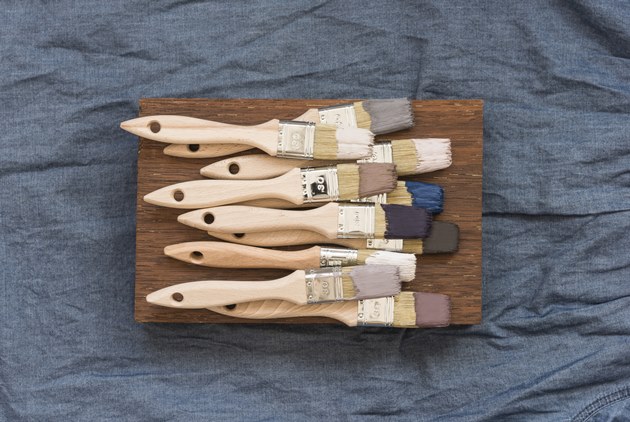
Thus, a color that responds to the need of a warm nest was elected as the Color of the Year for 2018–Heart Wood.
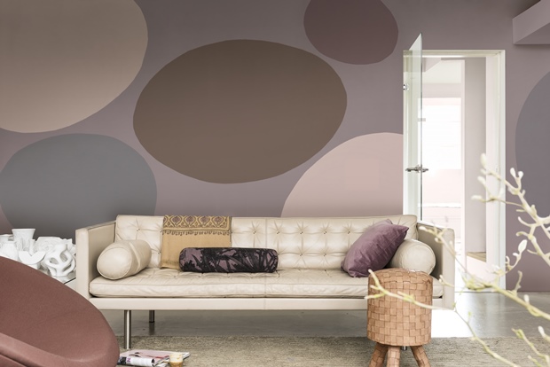
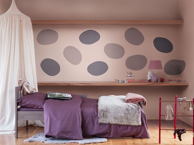 Source: Dulux Paint
With a calming nature-inspired tone of lotus roots, Heart Wood embodies the soft tenacity of a warm embrace. With a shade of grown-up pink, Heart Wood shares the popularity of pink in the color choice of interior design and furnishings. When matched with bright colors, Heart Wood creates a delighting atmosphere. Combined with dark colors, it gives a healing sense of security. Going with wood or other natural tactile qualities, it conveys comfort, warmth, and maturity.
“People are looking for new ideas to facilitate everyday life, constantly identifying what is necessary and what is not,” said Singaporean interior designer, Cameron Woo, as one of the participated experts. “We have definitely seen now a movement towards more isolation and urbanization. This means we have lost our connection with Nature,” stated Claudia Lieshout, Creative Director of Philips Design.
Biophilic Design–for a Closer Relationship with Life and Nature
Yet, out of the dark clouds appears a light of hope. As one of the participants, British architect designer Oliver Heath promotes the idea of Biophilic Design, an eco-design trend that introduces Nature into the doors of urban cities, a new concept that is expanding around the world like green architecture and sustainable design.
According to Heath, 98% of humans would agree that they feel the most calm and creative when surrounded by Nature, by mountains and rivers, or when sitting at home. Based on this idea, he attempts to integrate happiness, productivity, and creativity in his designs.
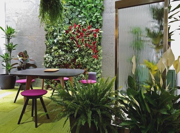 Source: Instagram@oliverheathdesign
The idea of Biophilic Design was inspired by Edward Wilson’s book Biophilia (1984), explained Heath. The book suggests that humans possess an innate tendency to seek connections with nature and other forms of life.
Through his design, Heath aims to bring the elements of Nature to everyday working and living spaces, with colors, curves, and shapes that would welcome humans back to the embrace of Nature.
Translated by Sharon Tseng.
Additional Reading
♦ Winners Embrace New Trends
♦ 'Everything Is a Design'
♦ Making an Art of the 'Simple Life'


