Designing Victory
Engineering the Look of Tsai Ing-wen's Presidential Campaign

Source:CW
Tsai Ing-wen's political campaign and Aaron Nieh's designs turned out to be a perfect match as well as an ideal example for Taiwanese brands.
Views
Engineering the Look of Tsai Ing-wen's Presidential Campaign
By Yueh-lin MaFrom CommonWealth Magazine (vol. 598 )
The first thing one notices upon entering Aaron Nieh's studio in Taipei's Minsheng Community is a white poster with plain black lettering reading "i hate communications."
The poster, Nieh's own design, is a self-mocking greeting, eliciting a knowing chuckle from visitors.
For as a professional designer, Nieh is a master communicator, whose "Light Up Taiwan" visual message of generational and ethnic unity underpinned Tsai Ing-wen's presidential campaign. His "Democracy at 4 am," a full-page ad placed in the New York Times, informed the international community about the democratic ideals and demands of 2014's Sunflower Movement. His design also breathed freshness into the recently issued stamp folio commemorating Tsai's inauguration, communicating modern aesthetics and bold ambition embracing change. And the limited-edition "President Tsai Ing-wen beer", timed to launch concurrently with the stamp issue, sold 720,000 bottles in the first batch, demonstrating that a special-issue beverage marking the president's inauguration can be refreshingly novel and inexpensive.
Using the language of design for broader, more comprehensive communication is a necessity in this day and age. Nieh, 39, embraces this challenge, leading three associates at his studio to turn a new page for Taiwan's election campaign ground rules and political marketing.
"In addition to genuine love for what we do, if we can communicate good design concepts and aesthetic sensibilities through high-profile clients, it should exert a subtle overall effect towards change in Taiwan." Nieh relates that, in addition to agreeing with Tsai's philosophy, he decided to take on the task of key visual design for her campaign in hopes of enhancing people's appetite for beauty, and in so doing impact both society at large and the design community.
In Taiwan, where ideology can dominate all else, closely aligning oneself with politics might not seem like such a bright idea. Nieh says, however, he felt it was worth a try despite the risks.
For some time now, Nieh's spare, highly modern, bright and fresh design style found tremendous popularity and favor in CD packaging and book covers. He has designed albums for big names in music like May Day, Jay Chou, Jolin Tsai, and Yoga Lin, regularly conceives promotional materials for the National Theatre and National Concert Hall, and directed the visual effects for the 50th Golden Horse Awards.
Nieh spends a considerable amount of his time looking at international design trends. Every design theme he works on needs to be thoroughly conceived to formulate an approach, and every detail needs to be taken care of. The modern, fashionable flair of his designs is popular with young people, earning him client commissions beyond Taiwan from China and Japan, interpreting popular culture with aplomb.
In 2012, Nieh's design professionalism and social influence helped him emerge from many recommendations and evaluations to become the first member of the Swiss-based Alliance Graphique Internationale (AGI) from Taiwan, joining a select group of over 300 of the world's finest designers.
Have you read?
♦ How Taiwanese Design Can Stem the Korean Tide
♦ Fighting for Taiwan: Designer Johnason Lo Takes Local Design International
♦ Andre Chiang: Perfecting a Branding Philosophy
From Art to Politics
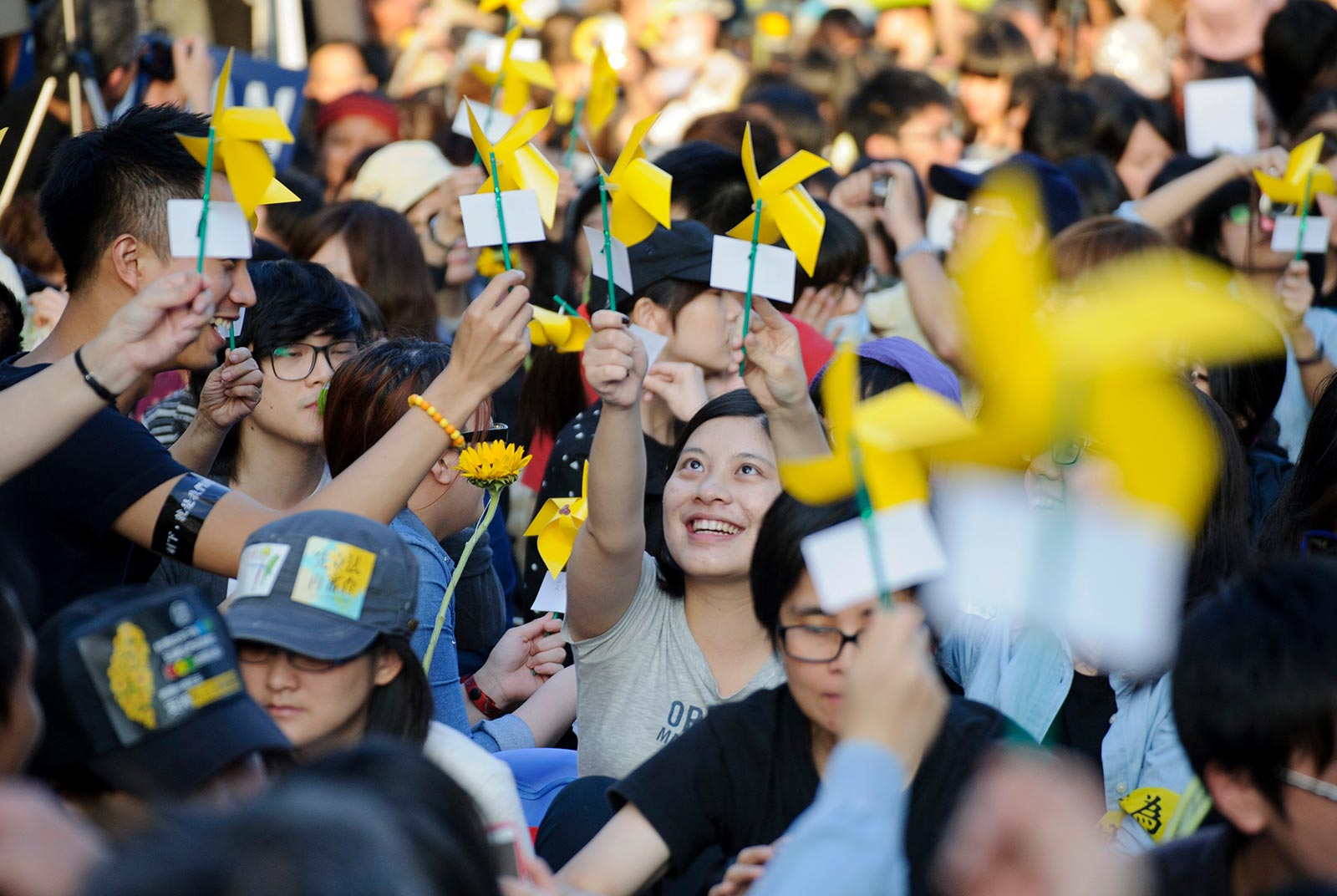
Nieh has done and seen a lot in the design realm, but he sees beyond just his own career. Upon learning that the 2014 Sunflower Movement was looking to place an ad in the New York Times, when a friend approached him to help, "I sent a Facebook message to the contact person introducing myself as a graphic designer, and asking if there was anything I could do." This was an interesting experience for Nieh, as that person initially declined the offer, unaware of Nieh's reputation, but after doing some poking around online, quickly got back in touch with him.
"The Sunflower Movement opposed ‘backdoor deals' over the Cross Strait Service Trade Agreement; we held that if the pact were open and transparent, then it could be open to discussion," recalls Nieh, who as a concerned citizen wanted to use his professional skills and know-how to help further the movement.
It was this occasion that established his ties with politics, and later that year (subsequently successful) Taipei mayoral candidate Ko Wen-je asked Nieh to design the key visual for his campaign. However, unwilling to dilute his motivations for helping out the student movement with an advertisement design, he politely declined, instead recommending three other designers for the task.
"This presidential election marked the third changeover of ruling parties in Taiwan. The new era means looking for new opportunities; youths composed a vital force in the latest election, and we should respond to them in some way," relates Lee Hou-ching, director of the Democratic Progressive Party (DPP) Media and Innovation Center.
While designs for political purposes were often decided by vote in the past, with the majority carrying the decision, such an approach has often resulted in aesthetic compromise. "The issue of taste in promotion and communications is actually autocratic, and should respect the professionals and their opinions," Lee adds.
When U.S. President Barack Obama was campaigning for office, his team placed over 100 pages of visual identity system guidelines on the Internet. For the January elections in Taiwan, the DPP took a similar approach, using nearly 50 pages to communicate with legislative candidates. "The last thing we wanted to see was candidates going ahead on their own and putting their ballot number directly inside that circle," says Lee.
The visual design for the Tsai Ing-wen campaign was largely the work of Nieh and collaborator Chen Sheng-chih, a young designer under 30. After compiling and analyzing a large number of cases from around the world, they proposed six different designs for the DPP to choose from. To their delight, Tsai's campaign chose the design Nieh and Chen liked the most, but were not confident would win out. "Because that option was the least ‘safe,' since to most people it was just a circle, plus people sometimes made a pun using Tsai's name that sounds like ‘water spinach,' so we were frankly pretty shocked they chose that one."
Nieh explains that circular shapes are easy to remember, and changing color fields inside circles carry a certain developmental logic and context, so presenting different shades of green to people, from light green to kelly green, and even light yellow, and almost bluish shades, could connect across different generations and combinations of groups with different viewpoints. Since it constantly circulates, it gave the overall design a dynamic feeling of constant movement.
Nieh explains that circles are easy to vary from a design standpoint. For instance, if you wish to stress equal rights, you can make them into rainbows; by placing a little airplane design on the side, it represents Tsai Ing-wen's U.S. learning tour. "The more elastic a design is, the stronger the applications for its use in a campaign," he says.
The night of Tsai Ing-wen's election victory, January 16, Nieh chose an image to use as her Facebook banner made by a Japanese photographer in Hualien of a farmer bending to harvest her crop. He complemented the picture with these words: "Is the country great? The country owes its greatness to you." The polished, nuanced visual design can communicate on multiple levels.
Nieh also decided on the widely discussed presidential inauguration commemorative stamp, which utilized simple digital geometric pixels and lines.
"We chose to use pixels for the point-by-point composition, which was useful in further discourse. Since Tsai Ing-wen and (running mate and now Vice President) Chen Chien-jen's victory was the outcome of many individual votes, it was the ultimate aggregate expression of the people," Nieh says. He sought expressly to use a starkly different approach from the tried-and-true portrayal of candidates through portraits in order to make people feel that "this is real contemporary design, as simple as can be. It just works!"
Ultimately, Nieh's design brand and Tsai's political brand achieved synergy, building off of each other. This new coming together of disparate elements in turn pointed to fresh possibilities for Taiwan's social consciousness and pursuit of politics, communication, and aesthetics in the future.
Translated from the Chinese by David Toman
Views

Subscribe to CWE Newsletter (every Thursday)
Stay abreast of what's happening in Taiwan with our weekly digest.